Welcome back to my Readalong. Today I’m thinking about covers. There’s an old saying ‘you can’t judge a book by its cover’. But while I agree with the spirit of that adage, those who work in publishing and bookselling probably know that good covers do make books sell, while, shall I say, less good covers can harm a book’s chances. Because, rightly or wrongly, buyers, and borrowers too, do judge books on their first appearances, choosing which books to pick up and browse, often based on what they look like.
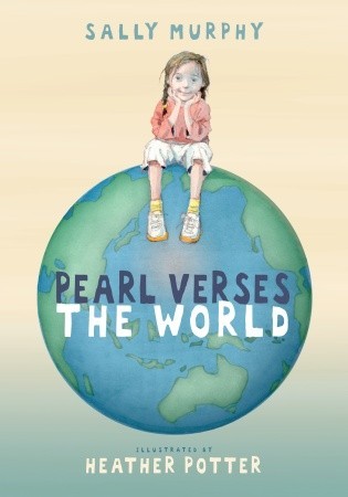
So, to the cover of Pearl Verses the World:

I loved it the first time I saw it, and have loved it ever since. I love that Heather Potter brought the character of Pearl to life with such a deft, tender touch, and perching her on the world was genius. I also love the font choice, and the colour palette too. Heather’s illustrations and the design team at Walker Books Australia together creating something that I think is pretty special. I feel like it’s okay to be a bit biased about my own book, because I had absolutely nothing to do with this brilliant design.
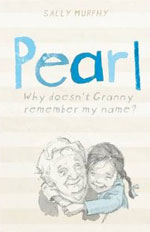
However, when Pearl was published in the UK, the team at Walker UK felt that the cover was not quite right for their market. Not only that, they didn’t like my title, which they felt was a bit too ‘clever’ with its play on words. So, they shortened the title, used a different illustration and muted the colours down to very subtle stripes:

And what did I think? Apart from feeling sad about the title change, I loved this cover too. I think the tag line and the illustration gave a strong sense of the book’s essence.
Over in the United States, however, Candlewick Press seemed to prefer the original title and cover – their change was to produce it as a hardcover book, which was pretty special.
Back to my point about judging books by covers. If I can judge the covers by how many of each version sold, then it would seem the original cover was the best one. But that ignores the fact that in my home country my publisher and I were able to promote more directly and more widely and, when it was shortlisted or won a variety of awards (more about those in another post), that also boosted sales.
For me, I prefer the original cover because it was the first I saw, and it’s the one that settled in my heart, but I like the others too – and if someone is reading my book and spending time with Pearl, then any of the covers has done its job.
Which do you like?
[…] week, as part of my Readalong, I posted about the two different covers – and titles – that Pearl Verses the World had when it […]