Last week, as part of my Readalong, I posted about the two different covers – and titles – that Pearl Verses the World had when it was published in Australia and the UK. That topic drew a lot of reaction, with comments on my own Facebook page being universally in favour of the Australian cover, but the dozens of comments on the SCBWI West page more divided, though still mostly in favour of the Australian one.
This week, I thought it might be fun to repeat the process by looking at the covers for Toppling which had not two, but three different covers – in Australia, the USA and the UK where, again, the title was also changed.
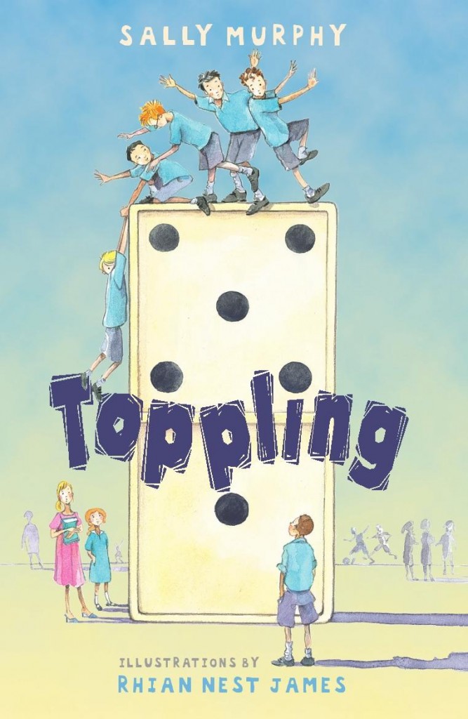
First, the Australian cover:
I love Rhian Nest James’ illustrations and the cleverness of having John and his four friends balanced (precariously, in Dominic’s case) on top of the domino. Readers who know the story will also pick out Ky looking up, and Lily and Miss Timms to the left. Very clever, right down to the choice of the number of dots on the domino. Another thing I love is the way the Walker Australia team designed the cover so that, while it’s different than Pearl Verses the World, its design links my two books visually.
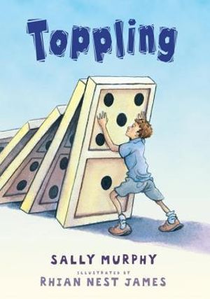
But, when the book was published in the US, Candlewick decided to change the cover:

Although they kept the font and colour palette, you can see that the illustration is new, commissioned for this edition. It’s a lot simpler – the focus is squarely on John, the viewpoint character, and his connection with dominoes, as well as the challenges he is facing keeping everything in order.
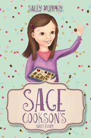
Lastly, Walker UK created a very different cover. Having change the title of Pearl Verses the World to simply Pearl, it was felt that the books would be better linked if names were also used in the title of this book. So, Toppling became John and Dom, and the cover used a similar design to the one for Pearl:

Everything is different than the Australian and US covers: the font, the illustrations, the colours and layout, and there’s the addition of a tag line. There’s not a domino in sight either. I do like this image, but I must confess I mourned the loss of the title, and the dominoes. although of course they are featured in the story, which remained unchanged.
So, three covers, two titles. I’ll admit the Australian version is my favourite – but I’m curious to know which you prefer? Leave a comment, if you like.

