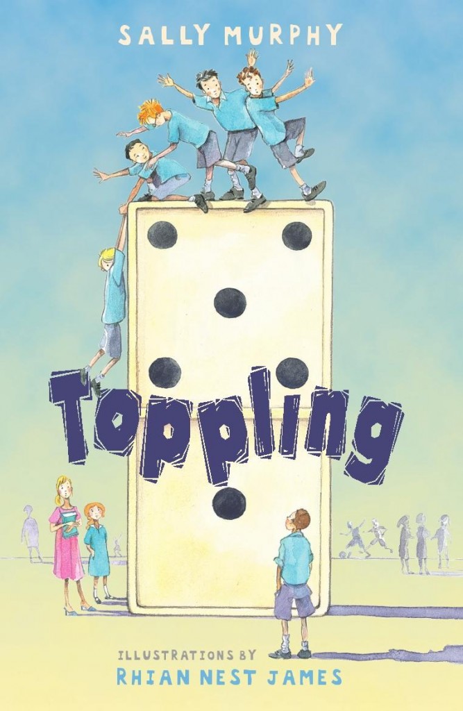
As part of recent Readalong, I reflected about each of the covers of my three previous verse novels: Pearl Verses the World had had two different covers, and two different titles, for different editions; Toppling had had three covers and two titles, and Roses are Blue just the one cover. Additionally, there was branding. As you can see from the three Australian covers, whilst there’s not a series, the cover design links them to me, the author,and to the style of the book, all verse novels.
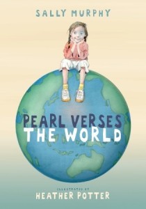
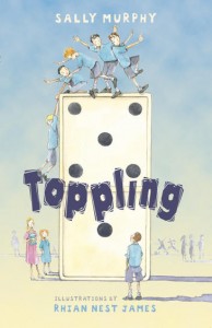
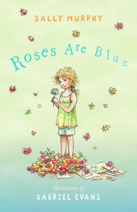
I have always loved these covers, and the branding part was exciting to me, because it felt like the brand was ‘Sally Murphy’ – even though of course there is a lot more to it than that. I felt that the cover design was a perfect match for the illustration style and for the form and content of the books. And feedback from readers young and old matched that. My post about the Pearl Verses the World cover, especially, drew dozens of comments here and on Facebook and Instagram.
However, the cover of my fourth verse novel, Worse Things is different. Very different.
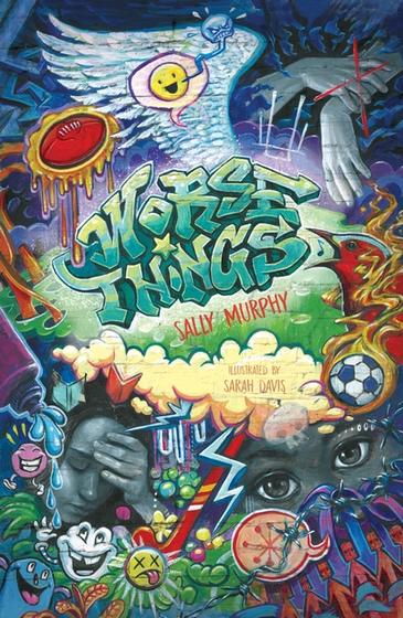
Everything is different – the colour pallet, the font, the and the illustration style, too. The illustrations take up the whole cover, with the title part of the illustration. But guess what? I love it just as much as I loved those other covers. Why? Because I think it’s perfect for this book. And I think Sarah Davis is a genius.
Although still a verse novel, and having some similarities in style and even themes, Worse Things is a bit of a break away from the earlier ones. The age of the characters is slightly older than the characters in the earlier books, meaning it is likely to be enjoyed by slightly older readers – although I think readers who enjoy the first three will also connect with the fourth, and vice-versa.
Worse Things is also a multi voice novel, with three characters telling the story, and I love the way Sarah has captured key elements of each character’s life and their story, and used them on the cover. Readers will hopefully come back, after they’ve read the book, and be able to see why those images are there.
I’d love to hear what you think about this new cover. If you haven’t read the book, what do you think is suggested by the images? You can comment here, or on Instagram or Facebook.
And, if you’d like to get better acquainted with the cover, I turned it into a digital puzzle for you to have a go at! You’ll find that here.
